The thinking
behind the work.

Some of our work is easy to see, like a logo or a website. Much of it happens behind the scenes, in the systems that keep an organization running.

01Case Study

Building Lily & Ember from the Ground Up

People come to us with a mission they care deeply about. We bring it to the light and help it grow. Before we could do that for anyone else, we did it for ourselves: shaping our own brand, building our own systems, and approaching every decision with intention.

the lily is
your mission

The Lily & Ember logo: an orange lily on deep green, ringed in gold, above the words Lily & Ember

the gold ring is
the light we bring

SpaceIvory
GrowthSage
RootsDeep sage
MissionEmber
LightGold
AaHeadlinesClassic seriftimeless and trusted
AaNotesHandwritten scriptwarm and personal
AaEverything elseClean sans serifclear on any screen

Instead ofOur target market comprises purpose-driven stakeholder segments.

We sayThe people building with purpose and looking to make a greater impact.From our homepage

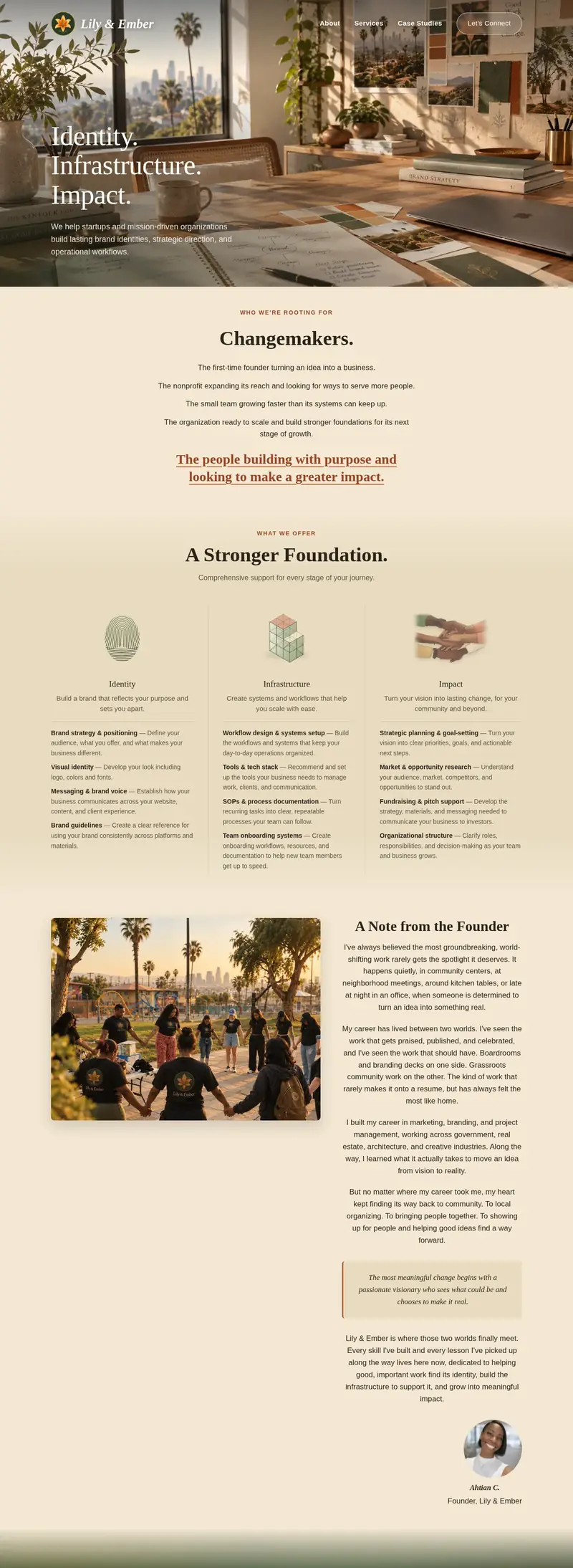
The Lily & Ember homepage, from the welcome section through who we serve, services, the founder's note, and the closing invitation

Lily & Ember
ecosystem

Messagesevery note answered
Meetingseasy to schedule
Filesorganized and shared
Projectsprogress in view
  1. We listen firstA conversation about what you’re building and where you want it to go.
  2. We share the planThe strategy, timeline, and next steps, laid out before the work begins.
  3. We keep you postedRegular check-ins, so you always know where things stand.
  4. We hand it offEverything you need to carry the work forward.
The mark1 of 7

What you see

A lily in ember tones.

Our mark is a single lily. Lilies grow with quiet strength and bring joy to the people around them, which is how we see the missions our clients bring us. The flower is painted in warm ember tones for the passion behind that mission. It rests on deep green, the roots and structure that hold it steady, and is ringed in gold, the light we bring to help it grow.

What you see

A palette drawn from the mark.

Every color in our palette comes from the mark.

  • Ivory the open space around it, room for ideas to grow
  • Sage the lily’s leaves, the growth that follows
  • Deep sage the ground it rests on, steady roots and structure
  • Ember the lily itself, the warmth and passion behind a mission
  • Gold the ring around it, the light we bring

Together they feel warm, grounded, and approachable, which is how working with us should feel.

What you see

Three typefaces, three jobs.

Our headlines use a classic serif that feels trustworthy and built to last. A handwritten script adds the personal touch, like a note in the margin. Everything else is set in a clean, open typeface that's easy to read on any screen.

What you see

Communicating with care.

We want every exchange to feel like part of one ongoing conversation. A first email, a meeting, a proposal: each picks up where the last left off, so the work keeps moving forward together. The tone stays calm and open, the way you'd talk with a trusted partner.

What you see

Built with intention, so it's clear and easy to experience.

Most visitors arrive with three questions: is this for me, what do you do, and who are you? So the homepage answers them in that order. It starts with who we're rooting for, then how we help, then the founder's story, and ends with an easy way to say hello.

Behind the scenes

Simple, connected, on purpose.

Behind the brand is a simple setup where messages, meetings, files, and projects all connect. Conversations stay organized, details are easy to find, and everyone knows where things stand.

Behind the scenes

A clear plan, shared from the start.

We thought carefully about the kind of relationship we wanted with our clients: collaborative, like business partners, and built on trust. Transparency is how we earn it. We come with a clear plan, share it early, and keep you updated as things move forward, so you never have to wonder what's next or where things stand. It's the piece that ties our foundation together. The brand is how people meet us, the systems keep the work organized, and the plan shapes how working with us feels.

How It Grew

From a clear purpose to a working foundation.

  1. the seed

    Starting with why

    Before any logo or website, we wrote down who we wanted to serve and why it mattered.

  2. taking root

    Finding our look and voice

    The lily, the palette, and the way we write came next, each one checked against that purpose.

  3. in bloom

    Opening the doors

    The website went live, with the systems behind it ready before the first inquiry arrived.

  4. still growing

    Learning with every project

    Each client teaches us something new, and we fold it back into how we work.

The Lily & Ember lily, fully in bloom

Our Foundation, Built with Yours in Mind

Our challenge was building a business from nothing: an identity people could trust and the systems to support the work, before we had a single client. Solving it for ourselves meant deciding how we would help others build theirs.

Every detail carries that decision, from the warm colors and the lily that stands for your mission and our light, to the way we write and the plan we share from the start. It’s how we make sure every mission we take on is rooted and brought to light.

End of Case Study 01